July 22, 2017
How we built the Imagine 2015 site
Originally published Feb 26, 2015 on Medium.
Imagine is Magento and eBay Enterprise’s premier eCommerce event held every year in Las Vegas. It’s an incredible event that many eCommerce merchants, consultants and developers look forward to year after year. At Imagine, people network with merchants, partners, developers, digital industry experts, and open source enthusiasts. We put a great deal of time and effort into making Imagine a spectacular and useful event, and an event of this magnitude needs a website to match.
The Imagine site is where attendees and prospective attendees go to get excited. It’s where we show off who’s speaking this year (last year Malcolm Gladwell was the Keynote speaker), who the sponsors are, and what companies were represented last year. Naturally you can sign up for email updates and buy your tickets from the site as well.
Business needs
Obviously we begun by determining the business needs for the Imagine site. I’m not going to go too deep into this part except to say that adding content ad-hoc had been a major pain point in years past. Since Imagine is an event, site content changes at a moment’s notice — new speakers are confirmed, new sponsors sign contracts, agenda items are finalized. Our solution has to support the fast-moving nature of an event of this nature. Our previous sites (<= Imagine 2014) had been built on WordPress, which is a fine selection, but it happened to be that it was built so quickly that not a lot of effort had been put into future-proofing content management.
On a practical level, that meant that some content changes were simple for the Imagine team to do in the WordPress backend, while others required a developer to write HTML, or worse, make a code change and push it live. More than any other requirement, the ability for the non-technical Imagine team to make changes to the content of the live site was the primary goal.
Tech stack
We decided on Drupal as the CMS pretty early on. We had recently finished replatforming Magento’s main website to Drupal with great success and were eager to build on that momentum. Of course the CMS is only a part of the larger landscape; in the process of building the site, we used all the following tools:
- Drupal 7 for the CMS
- Bootstrap 3 (thanks to the Drupal project integrating Bootstrap)
- LESS (with the LESS module for Drupal + lessphp)
- Jenkins + bash scripts + Drush for continuous integration
- Github Enterprise (eBay’s internal scm)
- Slack to keep teams connected. Jenkins & Github report into our Slack channels during builds.
Design review
During the Magento.com site redesign, the engineering and design teams discovered something wonderful: if these two teams work together rather than in silos, we all build faster and the final product is 1,000x more awesome. So we continued our methodology of having regular design review checkins, where engineering could ask questions, provide “doability” estimates, and give feedback.
An early design for the Imagine 2015 site.
For engineering, that meant we could strategize as a team as to how we thought we’d build the site out. The design above, for example, made us realize early on in the process that we’d want to use SVGs and other retina-ready graphics as much as possible. It also revealed some obvious mobile-friendly responsive moves we could make.
It was also interesting to see where engineering and design agreed without prior knowledge — pretty much everyone who saw the transparent fins around the circular cutout in the final design had the same thought of, “dude, those HAVE to rotate like a targeting reticle in Halo!”
Our design team took it a step further and actually created working mockups for how they envisioned the site working on mobile devices. This gave engineering crucial context around how to best build the templates from the ground up, keeping mobile in mind.
Once the design was finalized and approved, it was up to us to do the fun part (well, what engineers think is the fun part, at least): taking a bunch of Photoshop files and turning them into a real website.
Drupal methodology
Building a new site is fun, but Imagine 2015 was a little more than a new site. We had to take the following conditions into account:
- The pre-existing “Save the Date” site was being used for content entry (sponsors in particular). We can’t start from scratch and blow out that content.
- A team of 3 engineers will be doing major construction, including database schema changes. They need to integrate their changes with each other.
- We’ll be doing massive rebuilds of the theme layer (including an upgrade from Bootstrap 2 → Bootstrap 3), while preserving all content.
The best way to satisfy these conditions in Drupal is what I call the “Update hook + Features + CI” method. It’s a method I’ve used since the early days of Drupal 5 and it goes like this:
- Give yourself a baseline of the current Prod DB and code.
- Create a module that contains utility functions (a function to revert features, to install modules, to modify values in database tables, etc).
- (optional) Create a Feature for a related set of changes.
- Codify your changes (or enable your Feature) in update hooks that live in that utility module from step 2.
As a simple example, let’s say you’re adding a new content type. You can export that content type as a Feature, and then add an update hook that enables that Feature. So when you deploy your code and run update.php or updatedb, that new content type is automatically installed.
Practically speaking, this means that all your changes, no matter how simple or complex, will automatically take shape when your code is deployed. We continually run these hooks against a snapshot of production in our CI environment, so we know exactly what to expect when our code is deployed.
Update hooks + CI + Slack == winning
The best part about our CI setup is all the integrations. Github Enterprise tells Jenkins when there’s code to build, Jenkins talks to the servers and pulls down code, and then we get notified in Slack when there’s something new to look at, complete with a link to the dev environment. It is absolutely worth its own blog post, and if you’re not doing it yet I encourage you to explore it.
Building an incredible front page in Drupal
For our initial launch, the front page was by far the most complex single page on the site. One of the key business needs however was that it be super simple to manage the content. We did this by creating the Front Page as its own content type, and using a variety of Drupal modules to make the sections very clear and easy to manage:
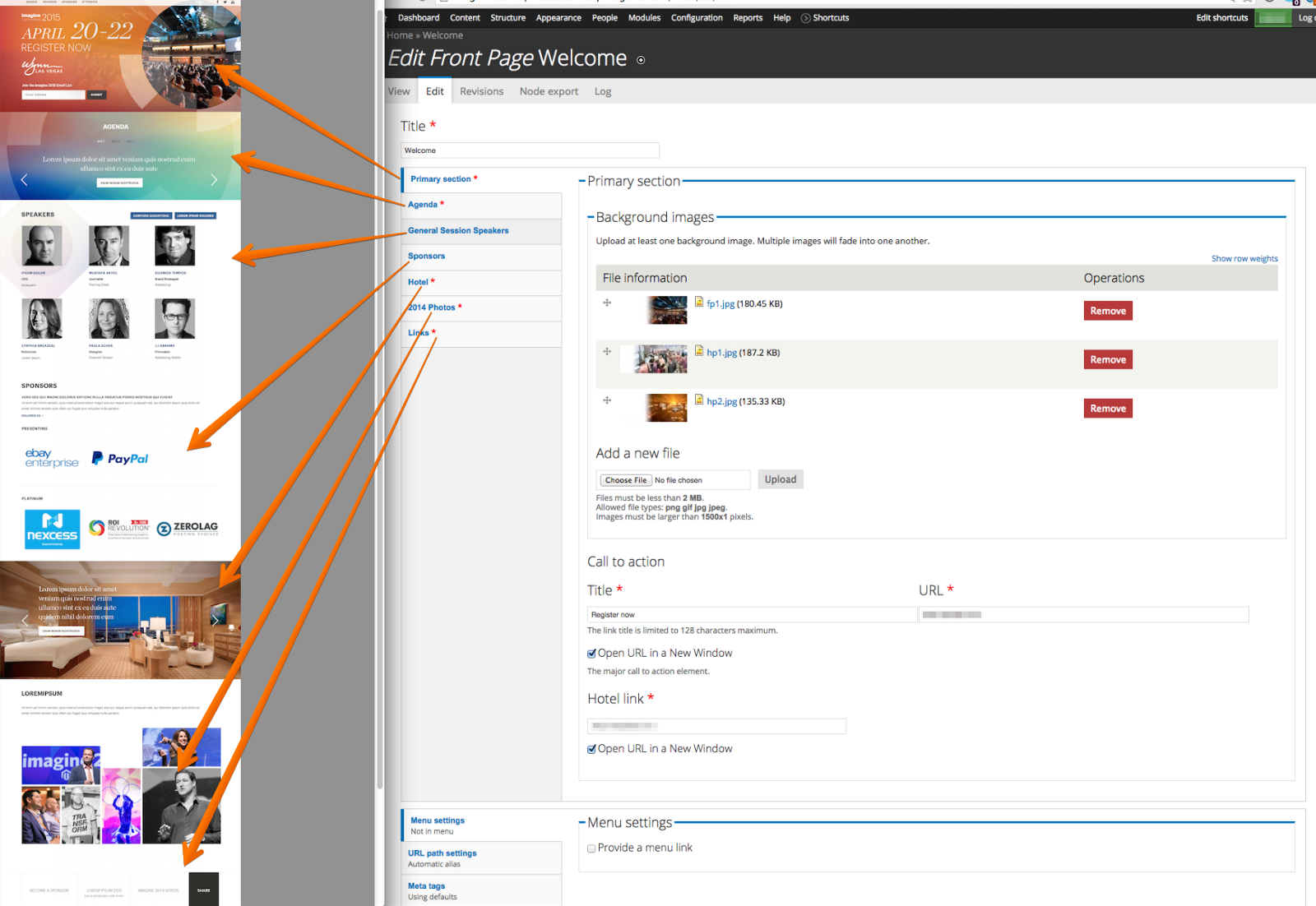
Some of the sections of that page are built with fields right in the content type, and others (like Sponsors and Speakers) are built by embedding Views into the node.
Some of the more interesting modules we used on the front page are:
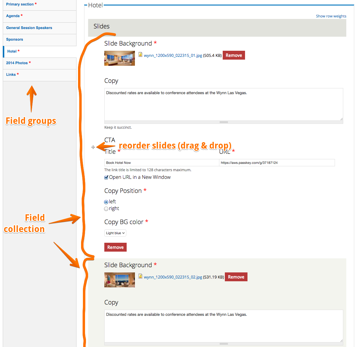
- field_group — to create the vertically tabbed interface you see there on the edit page
- field_collection (and its brother field_collection_deploy) — to create “add more”-able groups of fields. This is really useful for carousels which may have several fields (background image, copy, call to action…) per slide, and an arbitrary number of slides per carousel.
- viewfield — to drop Views directly in the node with no special embedding code needed
- views_bootstrap — to get Views using Bootstrap 3 classes.
Responsive design
Using Bootstrap 3 gave us a huge leg-up in implementing responsive design. Since our design team provided mockups, we were able to theme the front page fields with mobile in mind. Go ahead, open the site on your phone or tablet!
SVG stands for “Something Very Good”
Ok, it actually means Scalable Vector Graphics. On a high-dpi screen, non-photo graphic assets tend to look chunky and not-so-great, so we knew right away that we wanted to use SVGs for elements where it makes sense.

We use a slightly customized version of SVGeezy on the site to detect browser support. The cool thing about SVGeezy is that it will automatically swap in your fallback images if the browser lacks SVG support, and we hacked SVGeezy to add a no-svg class to the body in that case.
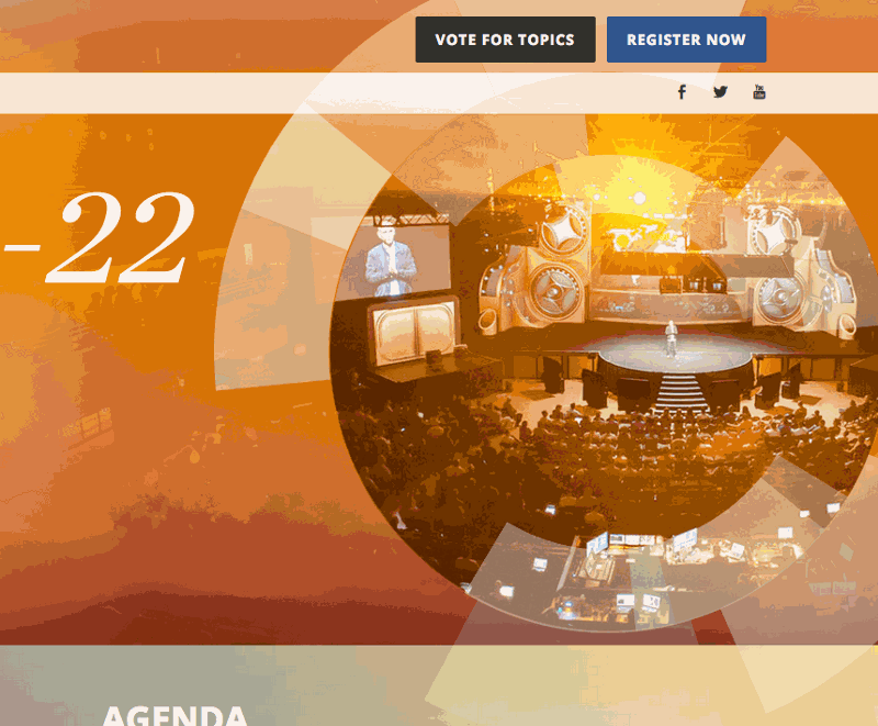
The other way-cool thing we did was animate some portions of the header.
Pretty much everyone agreed that the “fins” in the design needed to animate, because what looks cooler than that? But there were some major hurdles to getting this working correctly. Aside from just getting the elements animated in the first place, we had to worry about what it looked like on all kinds of devices on different platforms, what happens on mobile, and so forth. The simple answer would be to render a video, but there are a couple problems with that: 1) the fins actually overlap the following “Agenda” section, 2) a video that looks good with that much detail and motion will be HUGE, and 3) the team wanted the option to swap out background pictures ad-hoc. The answer in my mind was to build an animated SVG and overlay it on top of the slideshow behind.
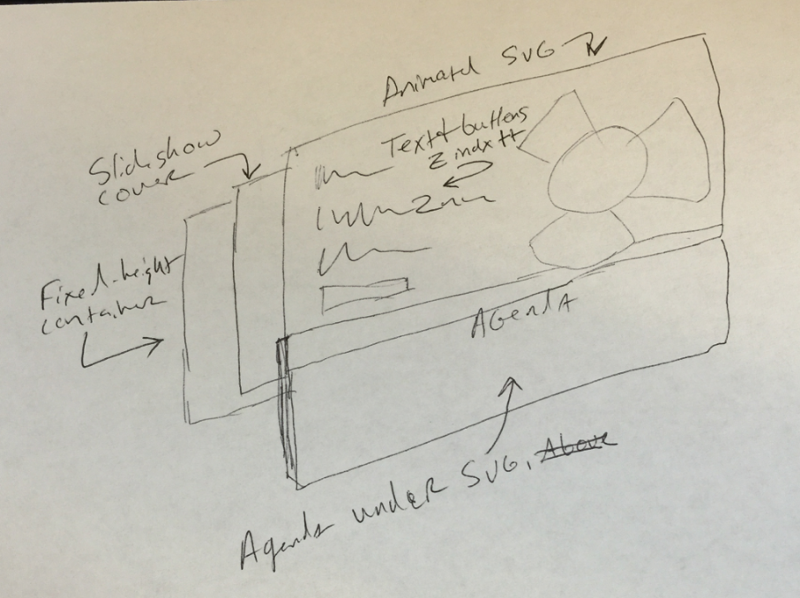
To further complicate matters, the slideshow images needed to be full cover, which is impossible with tags — they have to be background images. Of course you can’t fade background images in and out, so there had to be multiple divs, absolutely positioned, that held only background images, and a little javascript magic to swap between them smoothly.
Next the fun part, the SVG overlay. The SVG on the front page actually embeds the orange PNG, then draws the fins. The animation itself is pretty straightforward once you calculate the rotation point (the center of the circle cutout). Our designers generated the SVG for me, then I grouped the fins and gave each group a different transform value (clockwise, counterclockwise, slower, faster) to add visual interest.
I put the SVG in an absolutely positioned div to take it out of the document flow, then sized it correctly so it would fill up the hero section and still overlap the Agenda section. I messed with Z-index so that it was behind the hero text, but above the Agenda section. So far so good.
And then I opened the page in Safari and Firefox.
Firefox was spinning my CPU off the charts and Safari didn’t show the PNG that was linked in the SVG at all. I’m going to get right to the solution and give you the benefit of my hours of debugging — if you want an animated SVG to work everywhere:
- Remove all the header junk that Illustrator adds to the top of the SVG file (Safari and FF choke on it),
- Get the SVG as close to your final on-screen size as possible (FF takes a huge performance hit while scaling), and
- Embed the SVG directly in the page. Don’t use
<img>or make it a background in your CSS, just dump all the code right there in the page. It solves all sorts of problems.
Ultimately Firefox is just slow with SVG animations, it’s a known issue (see here and here). I think we squeezed out as much as we could using native tools (vs. a toolkit like Greensock).
Internet Explorer of course was another issue, but thankfully someone else did the work for us with the wonderful FakeSmile library. We dropped that in and boom, animations in IE, too!
There’s always more
Originally I promised to do a writeup on the Agenda section, but I never got around to it.